"This post was written as a practice exercise to improve my plotting skills in R."On August 1st, the Federal Statistical Office of Germany published a press release in English on the evolution of the age of young people leaving the parental household by sex (lengthier version in German here). I found the bar graph well made and I was interested to see how quickly I could reproduce it with ggplot2
The dataset “Estimated average age of young people leaving the parental household by sex” is provided by “Statistics | Eurostat”
Show the code of the exhibit
library(forcats)
library(dplyr)
library(ggplot2)

rva <- read.csv("./raw_data/yth_demo_030_linear.csv")
rva <- rva |>
  rename(year = "TIME_PERIOD",
         age = "OBS_VALUE")
rva <- rva |>
  select(sex, geo, year, age)


rva |>
  dplyr::filter(year == 2021) |>
  dplyr::filter(sex == "T") |>
  dplyr::filter(geo %in% c("PT", "EL", "IT", "ES", "AT", "FR",
                     "DE", "NL", "FI", "SE" )) |>
  mutate(geo = fct_recode(geo,
        Portugal = "PT",
        Greece = "EL",
        Italy = "IT",
        Spain = "ES",
        Austria = "AT",
        Germany = "DE",
        France = "FR",
        Netherlands = "NL",
        Finland = "FI",
        Sweden = "SE",
        )) |>
  ggplot(mapping = aes(x = age,
                       y = reorder(geo, age))) +
   geom_vline(xintercept = 26.5, colour = "#fd484e", size = 1.2) +
  geom_col(fill = "#2979b9", width=0.5) +
  geom_text(aes(label = age),
            hjust = 0, nudge_x = 0.1,
            fontface = "bold") +
  geom_text(aes(x = 26.5, y = length(unique(geo))),
                label = "Average EU-27:  26.5",
                hjust = 0.5, vjust = 1,
                nudge_y = 1.2, nudge_x = -2.05) +
  labs(title = "Average age of leaving the parental home, 2021",
       subtitle = "By year of age, selected EU countries",
       caption = paste0("Minimum in the EU: Sweden, ",
                        "maximum in the EU: Portugal\n",
                        "Source: Eurostat")) +
  ylab("") + xlab("") +
  theme(rect = element_rect(fill = NULL, linetype = 0, colour = NA),
               text = element_text(size = 12, family = "sans"),
               plot.margin = unit(c(1,1,1,1), "lines"),
               axis.title.x = element_blank(),
               axis.title.y = element_blank(),
               axis.ticks = element_line(size = 0),
               axis.text.x = element_blank(),
               axis.text.y = element_text(hjust = 0),
               panel.grid.major.y = element_blank(),
               panel.grid.minor.y = element_blank(),
               panel.grid.major.x = element_blank(),
               panel.grid.minor.x = element_blank(),
               panel.background = element_blank(),
               plot.title.position = "plot",
               plot.title = element_text(hjust = 0, face = "bold"),
               plot.caption.position = "plot",
               plot.caption = element_text(hjust = 0)) +
  coord_cartesian(clip = 'off')

ggsave("2022-08-02--leaving_home.jpg",
       width = 12,
       height = 6,
       bg = "white",
       dpi = 60)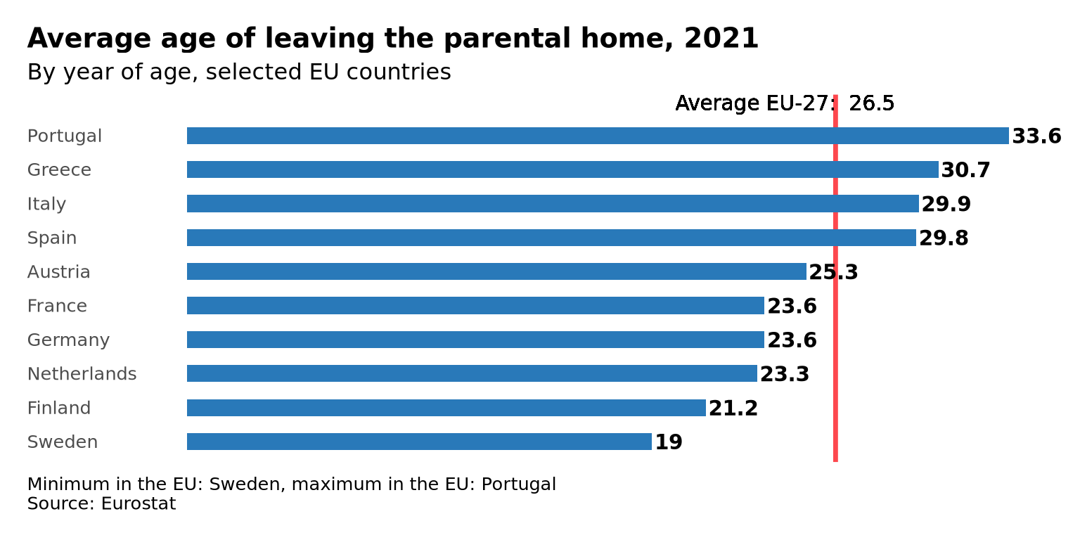
Now you can play and spot the differences (they are more than 7!)
